
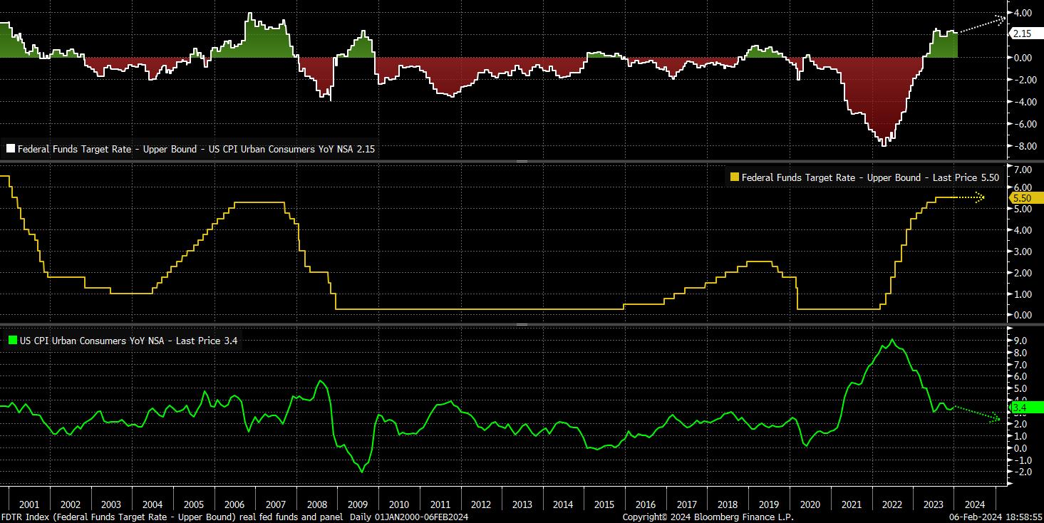
Firstly, a rather crude look at the target range for the fed funds rate is useful. Though it tells us little about the relative policy stance, it does help to evidence the extent of the tightening cycle that the Fed wrapped up last July, with over 500bp worth of hikes – including the most in a calendar year (2022) in four decades – taking the fed funds rate to its highest level since 2001.

While interesting, from a historical standpoint, such a chart tells us little about the overall policy stance. To gleam such information, one must look at the ‘real’ fed funds rate; the nominal rate, above, adjusted for a suitable measure of inflation. This helps one to gauge whether policy can be perceived as ‘tight’ or ‘loose’, particularly when compared to the natural rate of interest – more commonly known as r*.
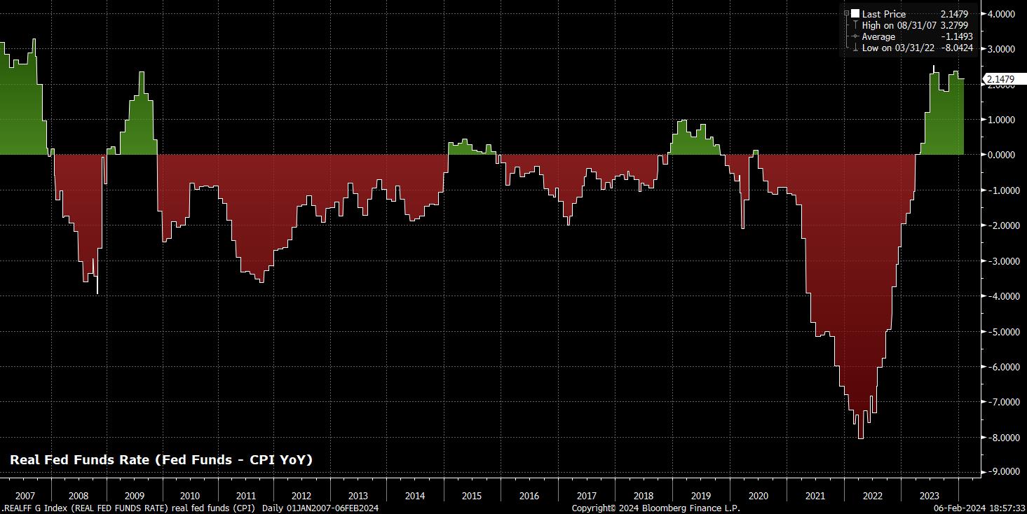
Again, rather crudely, a simple real fed funds rate can be constructed by subtracting the YoY change in CPI – the most widely used inflation metric – from the fed funds rate. Doing so, per the below chart, one can see that policy is at its tightest since the middle of 2009.
However, as alluded to above, there are many ways to calculate such a real rate, and many ‘suitable’ inflation measures that one may choose to use in such a calculation.
Perhaps the most important of these, though, is the one that Chair Powell himself has flagged as his preferred such indicator. Last May, in remarks that seemingly flew under the radar at the time, Powell noted that his preferred definition of the real fed funds rate is to subtract from it the one-year inflation breakeven. This being a market-based measure of expected inflation, derived from the difference in yield between nominal and real interest rates on Treasuries over said tenor.
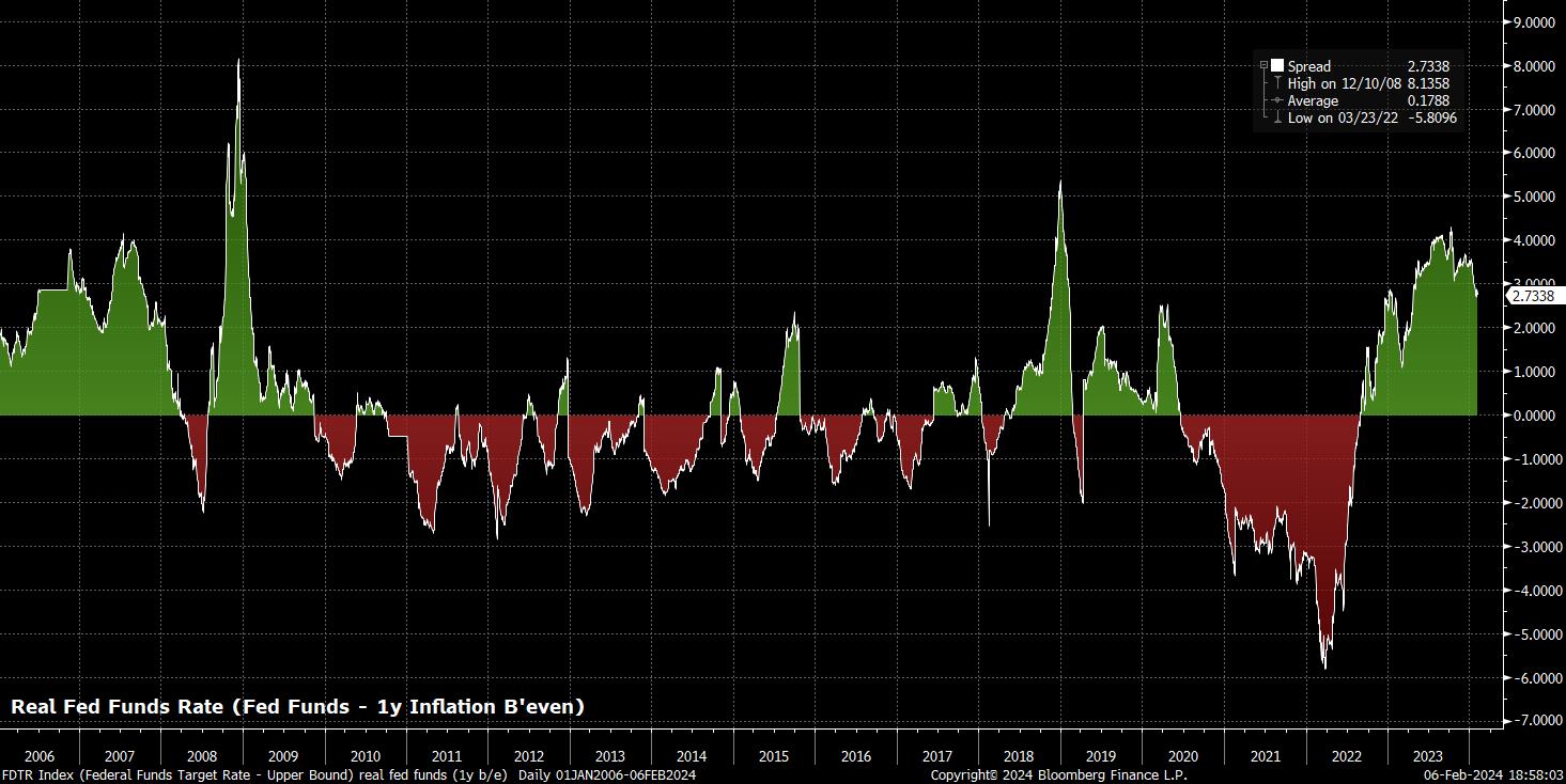
As is clear to see, using this metric produces a significantly different chart. Using Powell’s preferred measure, one can see that policy actually achieved a much ‘tighter’ stance during the second half of 2023, before having loosened rather notably of late, as inflation expectations re-anchor towards the Fed’s 2% target, with disinflationary momentum continuing. An aside, it’s also interesting how Powell’s measure points to policy having tightened more substantially during the 2015-18 hiking cycle, and subsequent market tantrum over Powell’s ‘autopilot’ balance sheet comments.
All of this may sound rather academic, and akin to something you’d read in a macroeconomics textbook, however there are important market, and policy, implications stemming from these various measures, and where they currently stand.
To digest these, one must recall the aforementioned components which comprise a real rate – namely, the nominal fed funds rate (set 8 times per year by the FOMC), and an appropriate inflation measure. The latter factor is the focus here, for now, as, were the FOMC to hold the target range for the fed funds rate steady, as inflation continues to return to the 2% target, real rates would rise, making the overall policy stance tighter and more restrictive, right at the latter stages of the economic cycle, as the Fed are attempting to stick the ‘soft landing’.
The below attempts to illustrate that point in graphical form, using the crude real fed funds rate per CPI discussed earlier.
This is where things get interesting.
If one were to set policy using the CPI-based real fed funds rate (or PCE-based, if the Fed’s favourite inflation gauge is preferred), the clamour for rate cuts would likely grow to a deafening level in relatively short order, as the continued fall in headline inflation – swaps see 2% by August – pushes policy into an increasingly restrictive setting.
However, if one were to instead set policy using Powell’s preferred model, based upon the 1-year breakeven rate, the story would likely be very different. As the earlier chart shows, per this measure, the real fed funds rate has actually been falling since the fourth quarter of last year, with policy having therefore – in contrast to many perceptions – become looser over the same time period.
The implications of this are important. As we heard from the FOMC last week, a firmly ‘data-dependent’ stance has been adopted, with the Committee seeking additional inflation data to provide ‘confidence’ that a return ‘towards’ 2% is on the cards. Unsurprisingly, there was little clarity around how much data, or how many more ‘good’ inflation prints would be required, before such confidence was achieved.
Despite that, the market-based real fed funds rate implies that policy is not in fact becoming more restrictive as price pressures fade. This means that, using such a model, policymakers are likely to be able to wait longer than they otherwise might to gain such confidence, threatening the OIS curve’s current pricing of the first 25bp cut being delivered at the May FOMC meeting, with a further four cuts of the same magnitude to then follow before the end of the year.
The pricing out of said cuts, were it to occur, is likely to provide a further fillip for the greenback, which already sits comfortably in positive territory on a YTD basis against all G10 peers, while also posing a downside risk for Treasuries, particularly at the front-end and in the belly of the curve.
Whether equities are able to whether such a potential hawkish repricing as well as they have done so far this year remains to be seen, though likely requires continued strong performance from the ‘magnificent seven’ stocks (or six, ex-TSLA) in order to do so.
_mag_7_2024-02-06_19-06-38.jpg)
There is a final important point to make on cuts. As the many charts above should prove relatively easily, the Fed cutting rates as the year progresses does not equate to policy moving to an outright loose stance.
Instead, the cuts that the FOMC – and most other G10 central banks – are set to deliver represent a move back towards a more neutral policy setting, dialling back the necessary, and rapidly-introduced restriction that stamped down on post-covid inflation now that price pressures have abated.
Such context is important, as one should not view the start of this rate cut cycle as a sign that we are soon to return to the post-GFC days of zero, or negative, interest rates – ZIRP and NIRP to coin the vernacular. Instead, policymakers are more likely to seek to return rates to r* (a fuzzy concept that refers to a level of the real fed funds rate which would keep activity at potential and inflation low and stable), and then keep them there. Though difficult to measure, r* in the US is currently estimated by most models to be around 1-2%, implying a 3-4% fed funds rate, if inflation were to return precisely back to target.
This means that, for the first time in many years, capital actually has a cost once more, and cash is likely to offer a more attractive option than over the last decade or so. Hence, structurally higher bond and equity volatility is likely to prevail over the medium-run, as markets adjust to this new, but oh so old-fashioned, dynamic.
Observing the Above
While the charts in this article have been created using a Bloomberg Terminal, it is possible to obtain some of the same information using TradingView.
This video covers the topic in substantially more detail - https://www.tradingview.com/chart/US05Y/uUoUKxcw-Rates-Obsession-a-pro-interest-rates-set-up-on-TradingView/
Related articles


此处提供的材料并未按照旨在促进投资研究独立性的法律要求进行准备,因此被视为营销沟通。虽然它并不受到在投资研究传播之前进行交易的任何禁令,但我们不会在向客户提供信息之前谋求任何优势。
Pepperstone并不保证此处提供的材料准确、及时或完整,因此不应依赖于此。无论是来自第三方还是其他来源的信息,都不应被视为建议;或者购买或出售的要约;或是购买或出售任何证券、金融产品或工具的征求;或是参与任何特定交易策略。它并未考虑读者的财务状况或投资目标。我们建议此内容的读者寻求自己的建议。未经Pepperstone批准,不得复制或重新分发此信息。