The Daily Fix: The ultimate week ahead playbook

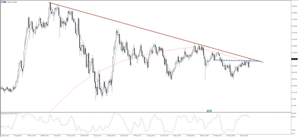
The USD is flat on the day, although, we’re focused on moves in USDJPY today, with the pair testing the 5-year downtrend and looking quite tasty from the long side, with price reflecting that of the S&P500.
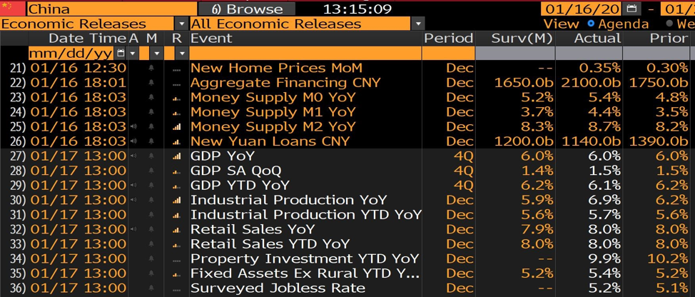
Modest moves can be seen in US fixed income, and again I can’t state enough how bullish it is for equities (and sentiment more broadly), that we are seeing no signs of worry and selling in US ‘real’ (or inflation-adjusted) yields despite the improving economics and commodity moves. China data continues to light up risk, and after yesterday's solid credit data, we’ve seen industrial production a punchy 100bp better than the street was looking for.
(Source: Bloomberg)
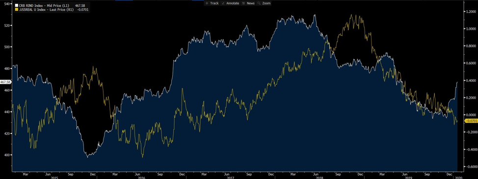
The dynamics are compelling. Low vol, better liquidity driven by central bank action, improving data, yet no sell-off in real rates and as we can see in below chart the CRB raw industrial commodity index is having a solid move higher, indicating the better economics. It is doing wonders for carry, and traders buying into the higher yielding currencies.
Weekly volatility report
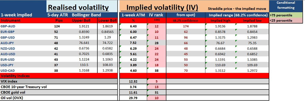
I touched on low volatility (vol), where we can visualise implied vol through various indices, such as the VIX index or JP Morgan global FX volatility index, which incidentally hit a record low today - or we can look at the options market and implied volatility for any currency pair and over a specified time to expiry. By using ‘straddle’ or ‘strange’ pricing we can understand the extent of expected movement in price.
In the video I look at a number of well traded currency pairs, as well as gold and US equities and assess, not just key measures of realised volatility, such as ATR or Bollinger Bands, but also implied volatility. This is key for me, as it is a visual of what the market thinks will be the degree by which price will move, up or down, and the content of this in relation to its 12-month range. I find this incredibly useful for understanding how the market interprets known event risk and can help us with our risk assessment and achieve correct position sizing.
I also look at rates pricing, risk reversals and futures positioning. Take a look, as I hope it can help you understand the backdrop by which you operate in, what’s working and what isn’t and can help you get perspective for the week ahead.
Feel free to subscribe to the YouTube channel to get notifications when new videos are produced.
Chris
The material provided here has not been prepared in accordance with legal requirements designed to promote the independence of investment research and as such is considered to be a marketing communication. Whilst it is not subject to any prohibition on dealing ahead of the dissemination of investment research we will not seek to take any advantage before providing it to our clients.
Pepperstone doesn’t represent that the material provided here is accurate, current or complete, and therefore shouldn’t be relied upon as such. The information, whether from a third party or not, isn’t to be considered as a recommendation; or an offer to buy or sell; or the solicitation of an offer to buy or sell any security, financial product or instrument; or to participate in any particular trading strategy. It does not take into account readers’ financial situation or investment objectives. We advise any readers of this content to seek their own advice. Without the approval of Pepperstone, reproduction or redistribution of this information isn’t permitted.