
Summary
Financial market charts serve as the foundation of technical analysis, offering a crucial visual depiction of price fluctuations across various asset classes.

Writen by: Aubrey Hayward | Expert Financial Writer
This guide will equip you with the knowledge needed to read and analyse diverse chart types effectively. Learn how to discern market trends, understand technical indicators, and implement robust risk management strategies.
The importance of market charts in trading
Financial market charts are the foundation of technical analysis, providing a clear view of price fluctuations across any and all instruments. The ability to interpret these charts is vital for identifying trends, pinpointing critical price levels, and making well-informed trading decisions.
Key features of market charts
Before examining individual chart types and their associated patterns, it’s a good idea to become acquainted with the core components shared by most financial charts.
Price movements and timeframes
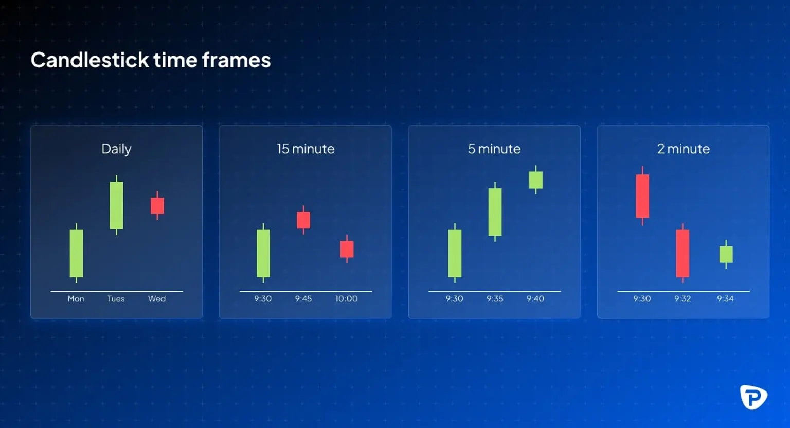
Financial charts illustrate an asset's price changes during a specified time frame. These time frames are diverse, encompassing:
- Short-term charts (1-minute, 5-minute, and 15-minute intervals): These are favoured by scalpers and day traders who focus on rapid price shifts.
- Medium-term charts (daily and weekly): These are typically used by swing traders and investors who maintain positions for several days or weeks.
- Long-term charts (monthly): These are employed by investors with a long-term perspective, allowing them to evaluate broader market trends.
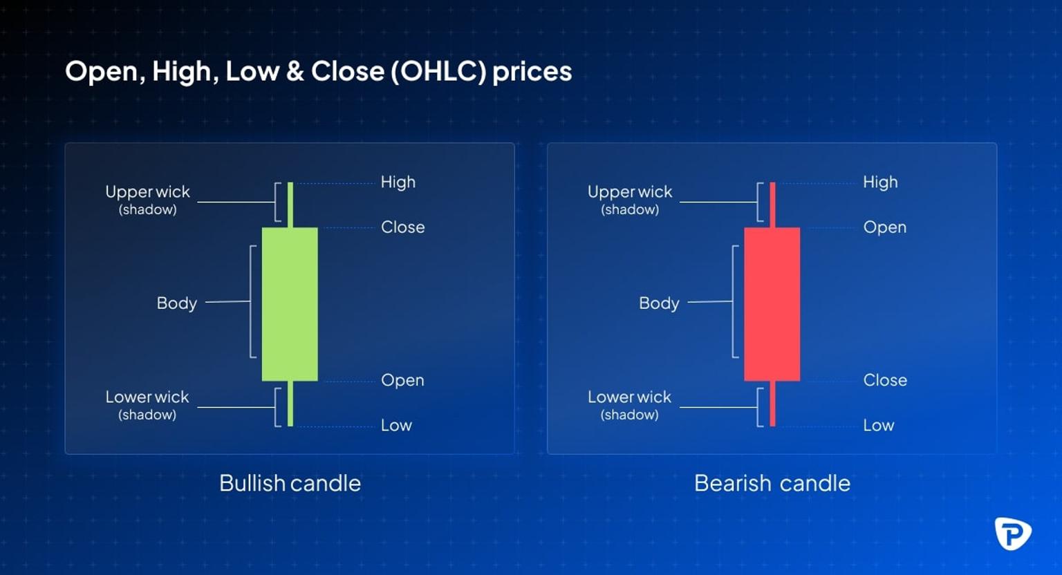
Open, High, Low, and Close (OHLC) prices
Typically, price movements on trading charts are depicted using the OHLC structure, which includes:
- Opening price: The price at which an asset begins trading within a defined period.
- Highest price: The peak price attained during that period.
- Lowest price: The trough price recorded within that period.
- Closing price: The price at which the asset ends trading for that period.
Comprehending OHLC data is essential for assessing price fluctuations and gauging market sentiment.
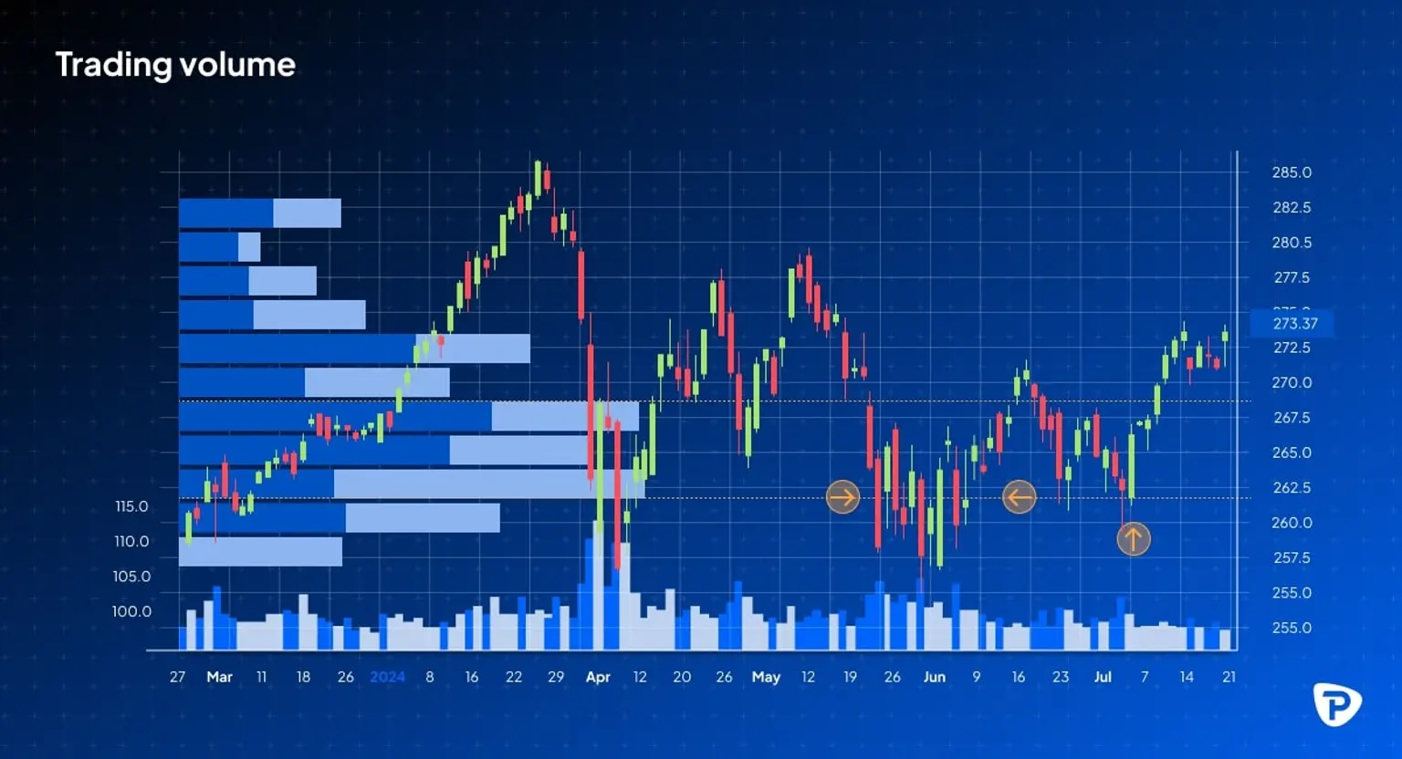
Trading volume
Trading volume, which represents the quantity of shares, contracts, or units exchanged during a specified period, offers valuable information about market activity and the reliability of trends:
- High volume: This signifies robust buying or selling activity, reinforcing the strength of a price movement.
- Low volume: This can suggest indecision within the market or a consolidation phase.
Choosing an appropriate chart type for your analysis
Here are three chart types that are commonly used in market analysis, along with which strategies they are generally most suitable for.
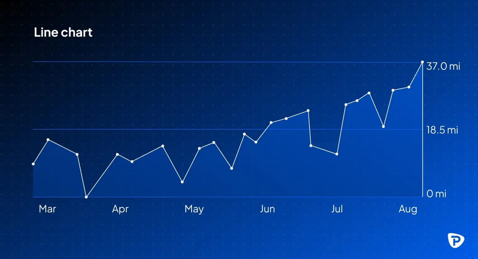
Line charts
Line charts simplify price patterns by linking closing prices over a specific time period using a continuous line. They are best suited for identifying long-term patterns and predicting the general direction of price movement. However, they do not give comprehensive information on price fluctuations over the trading session.
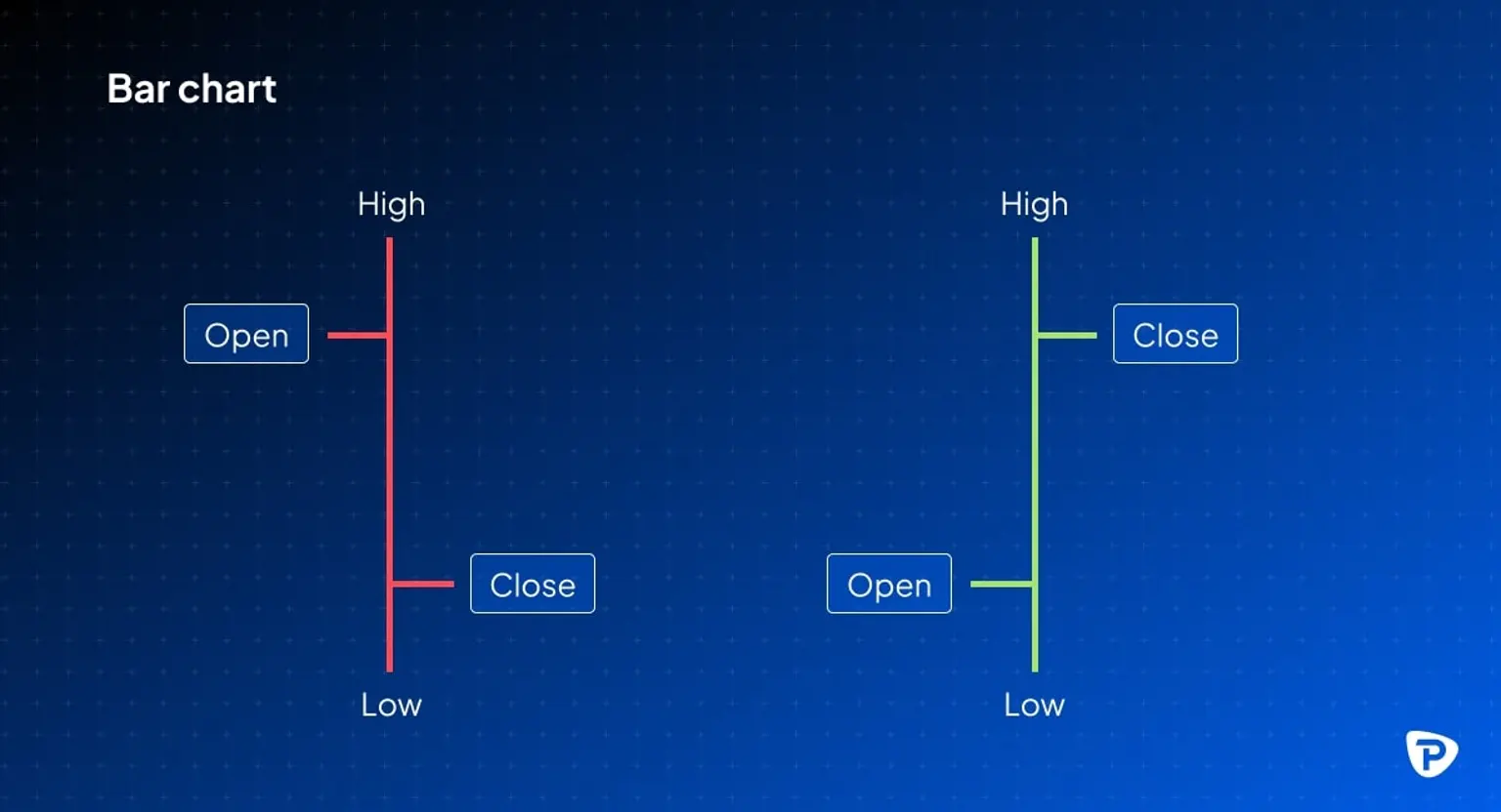
Bar charts
Bar charts give an in-depth picture of price activity by presenting the open, high, low, and close (OHLC) prices for each time interval selected. The vertical lines on the chart show the period's price range, while horizontal ticks on each side indicate the opening and closing values. This format can be very beneficial for traders who need to analyse price volatility and the overall market range over a specific timeframe. However, their multi-faceted nature might make chart analysis more difficult for beginners.
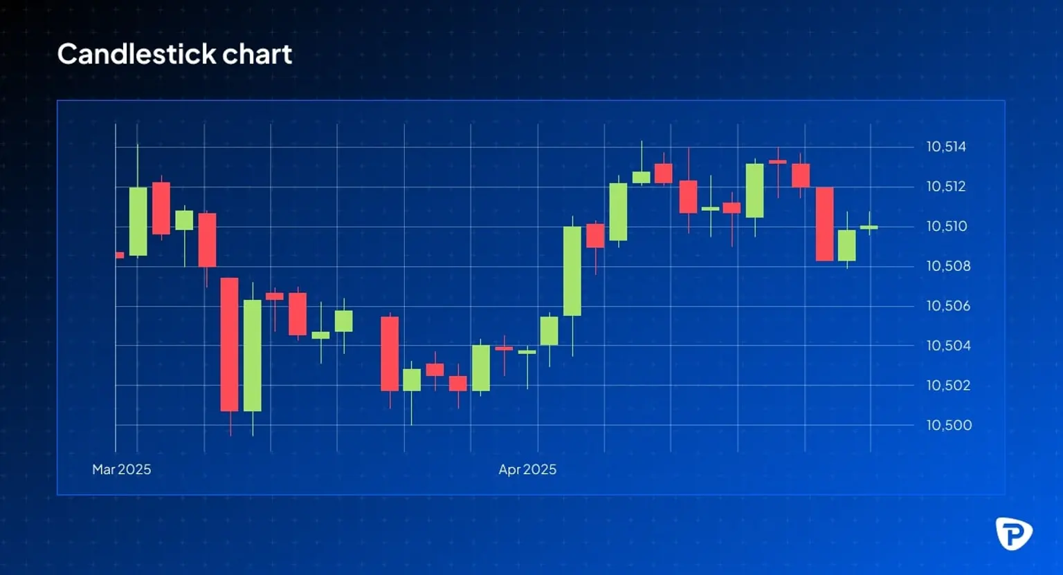
Candlestick charts
Candlestick charts offer a visually enhanced representation of price action, similar to bar charts but with ‘candles’ depicting the open and close prices as a solid body and ‘wicks’ illustrating the highest and lowest prices reached during a period. These charts are particularly effective for identifying patterns and potential reversals in price movements and are favoured by many. However, interpreting them successfully relies on a solid understanding of various candlestick formations.
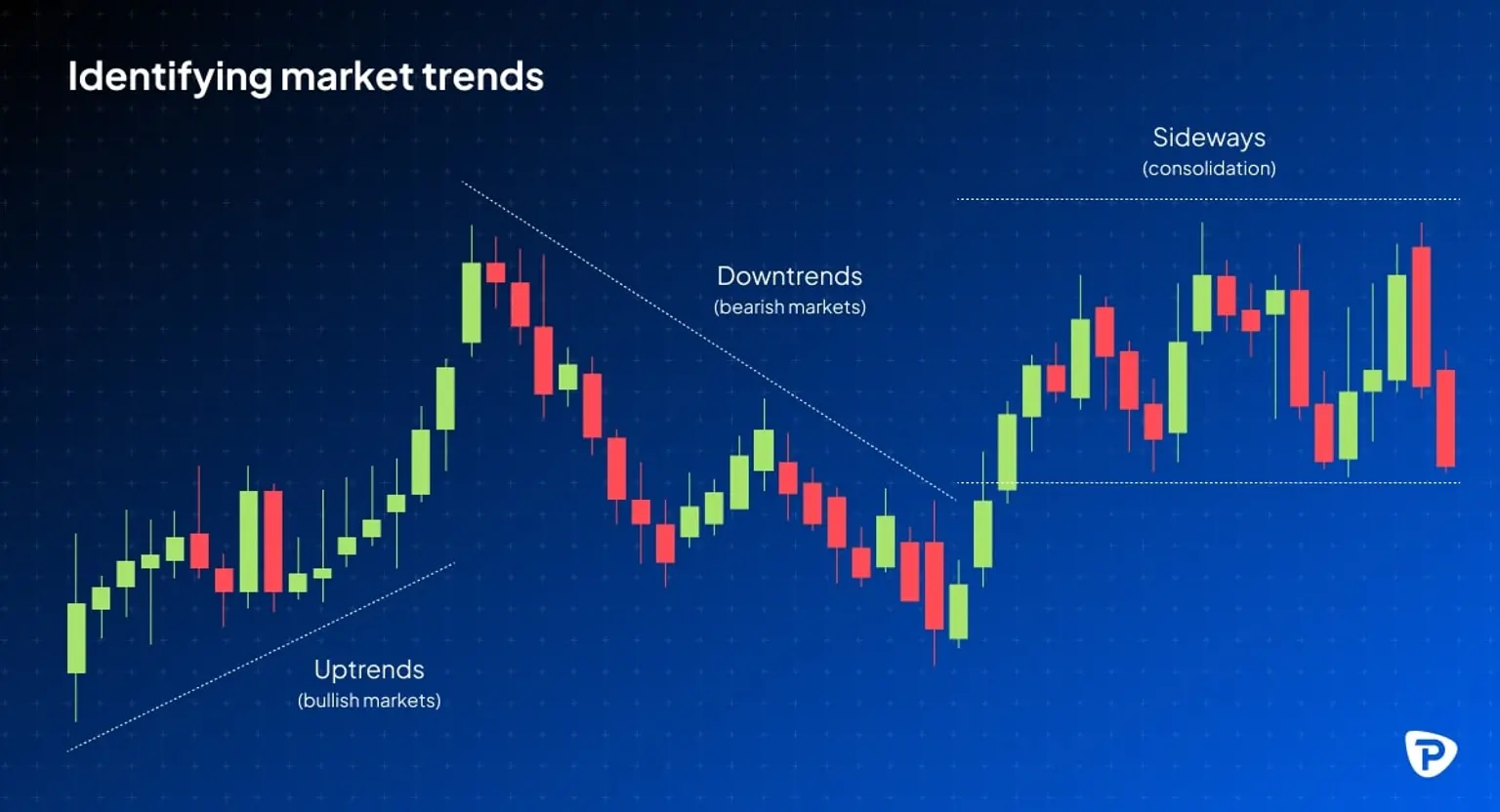
Identifying market trends
Recognising market trends is very important in predicting price movements, as they reveal the overall trajectory of an asset's price. The main categories of trends are:
Uptrends (bullish markets)
- Characteristics: Higher highs and higher lows, indicating increasing demand and upward momentum.
- Trading approach: You can look for buying opportunities during pullbacks to support levels.
Downtrends (bearish markets)
- Characteristics: Lower highs and lower lows, signalling intense selling pressure.
- Trading approach: You might consider short-selling or waiting for a reversal before entering long positions.
Sideways (consolidation)
- Characteristics: Prices move within a horizontal range, indicating indecision in the market.
- Trading approach: You might want to wait for a breakout in either direction before committing to a position.
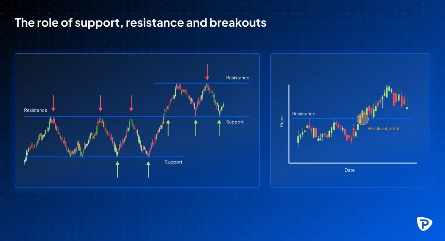
The role of support and resistance
- Support: A price level where demand increases, preventing further decline.
- Resistance: A price level where supply increases, preventing further rise.
- Breakouts: When the price moves beyond support/resistance, signalling a trend shift.
How to chart technical indicators for improved analysis
Technical indicators enhance market analysis by providing insights beyond simple price action. Here's a breakdown of three commonly used indicators:
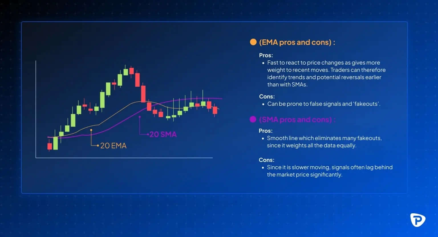
- Moving averages: These smooth out price fluctuations to identify trends. The simple moving average (SMA) calculates the average price over a specified period, while the exponential moving average (EMA) gives more weight to recent prices, making it more responsive to current market conditions. Visualising a chart with both 50-day and 200-day moving averages overlaid can help identify long-term trends.
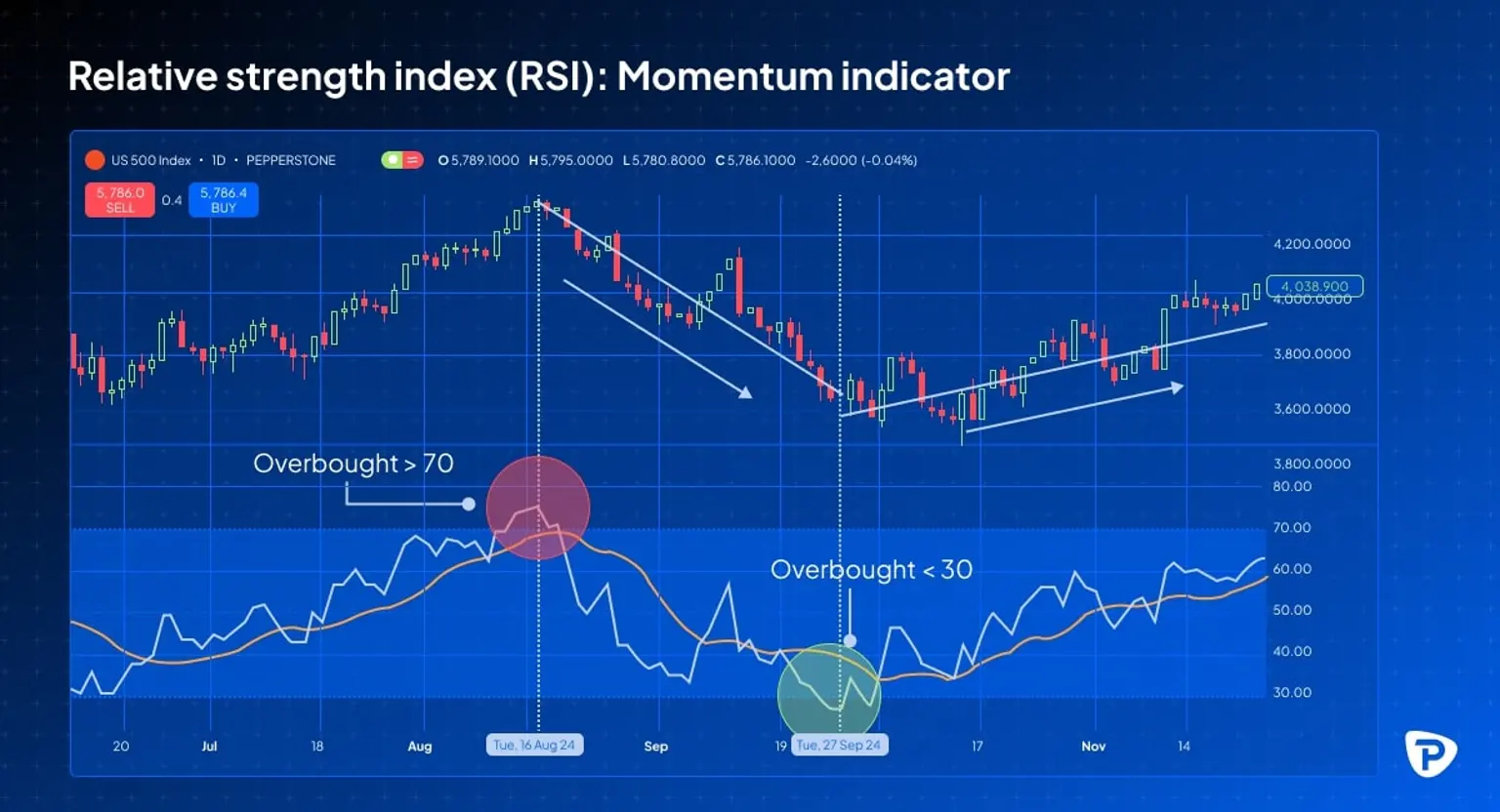
- Relative strength index (RSI): This momentum indicator measures the speed and change of price movements. An RSI above 70 suggests an overbought condition, indicating a potential price decline, while an RSI below 30 signals an oversold condition, suggesting a possible price increase. A chart highlighting the RSI indicator with overbought and oversold zones provides a clear visual representation.
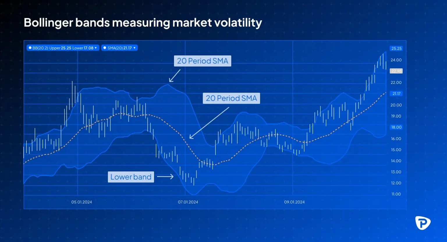
- Bollinger bands: These measure market volatility. When volatility is high, the bands widen, and when the market is stable, they contract. A chart depicting Bollinger bands expanding and contracting alongside price movements demonstrates the indicator's effectiveness in gauging volatility.
Understanding chart patterns and trading signals
Reversal patterns: Predicting market turns
Reversal patterns are essential tools for traders who want to anticipate shifts in market direction. Two noteworthy examples are:
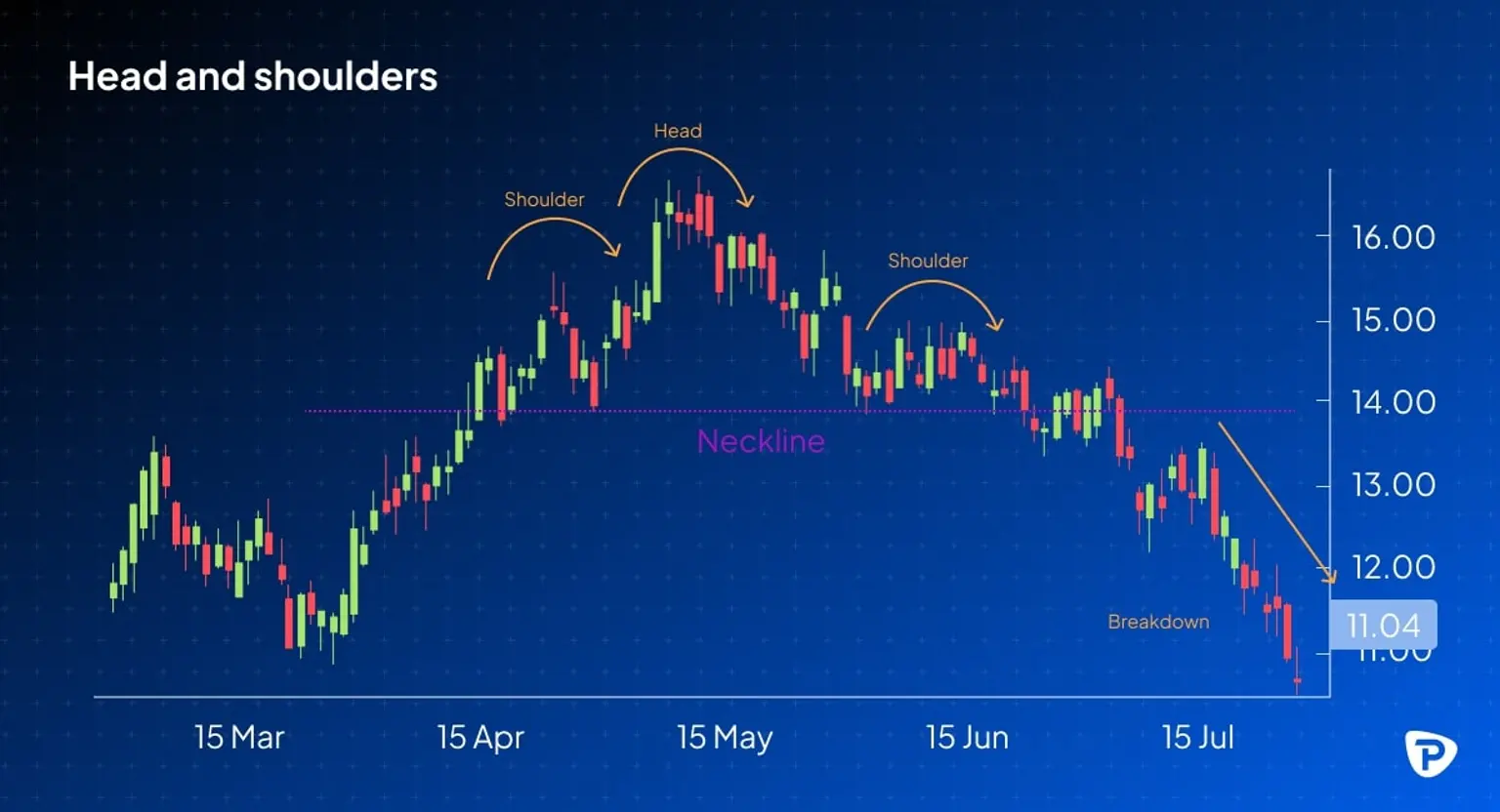
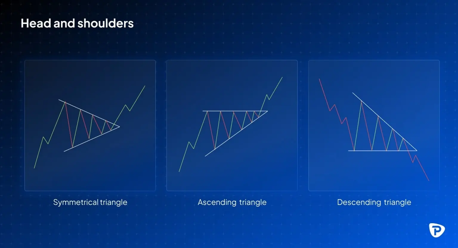
- Head & shoulders: This pattern frequently suggests a bearish reversal, implying that an uptrend is about to turn downward.
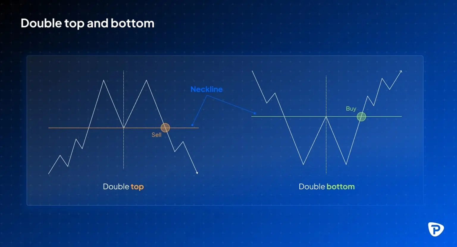
- Double top/bottom: These patterns indicate that the present trend is losing momentum and may be reaching its end, implying a reversal.
Continuation patterns: Confirming trends
Continuation patterns are helpful for traders who want to confirm the endurance of current market trends. Key examples are:
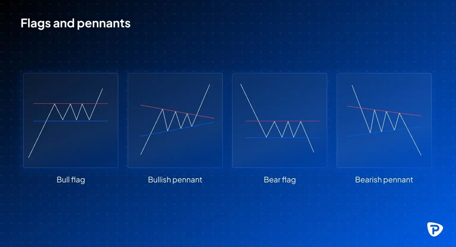
- Flags and pennants: These patterns indicate a brief period of consolidation inside a trend, implying that the trend will resume its previous path after the consolidation.
- Triangles: These patterns can indicate the likely direction of a breakout, enabling you to identify and profit from a trend's continuation.
Using multiple timeframes for better decision making
To improve trend confirmation and trading precision, it’s a good idea to analyse several timeframes:
- Short-term trading (scalping and day trading): This strategy tends to use charts from one-minute to fifteen-minute intervals.
- Swing trading: This strategy usually uses 4-hour and daily charts.
- Long-term trading: This method entails analysing weekly and monthly charts.
Advanced market chart techniques
Fibonacci retracement: Identifying key levels
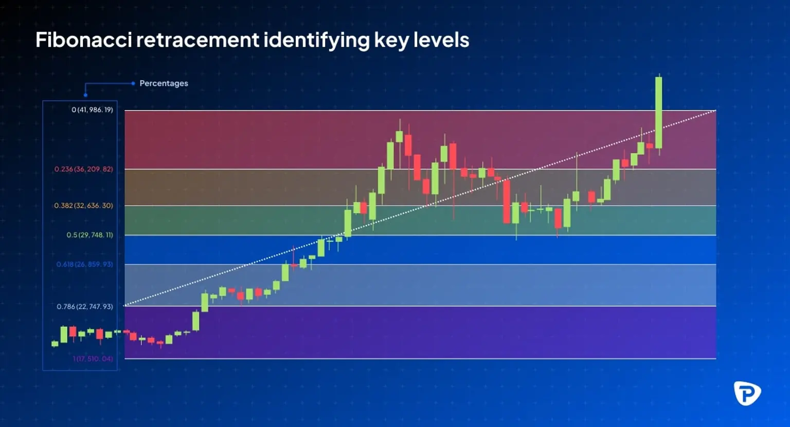
Fibonacci retracement is a technique based on the Fibonacci sequence that allows you to identify potential support and resistance zones using percentages such as 23.6%, 38.2%, 50%, 61.8%, and 78.6%. These levels help with strategic trade placement, such as entry orders, stop-loss settings, and profit objectives. You can frequently mix Fibonacci retracements with other technical analysis methods to improve the reliability of your strategy. However, be mindful of the risk of false signals and the significance of obtaining additional confirmation.
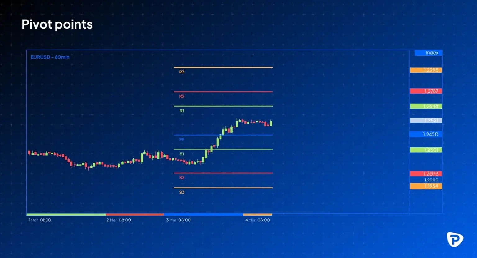
Pivot points: Finding intraday price levels
Pivot points are technical indicators used by day traders to identify potential support and resistance levels during the trading day. They are derived using the previous day's high, low, and closing prices and then used to forecast future price moves for the current trading session.
The basic pivot point (PP) is calculated as follows:
PP = (High + Low + Close) / 3.
Support and resistance levels are calculated using various methods based on this central pivot point. Common calculations include:
Resistance 1 (R1) = (2 * PP) – Low
Support 1 (S1) = (2 * PP) – High
Resistance 2 (R2) = PP + (High – Low)
Support 2 (S2) = PP –(High – Low)
Resistance 3 (R3) = High + 2 * (PP – Low)
Support 3 (S3) = Low – 2*(High – PP)
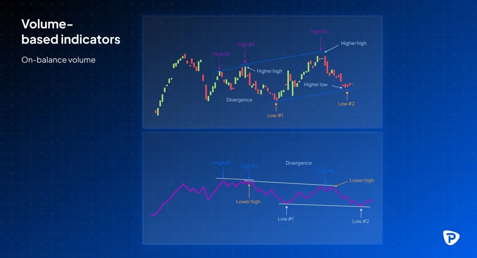
Volume-based indicators: Confirming market trends
- On-balance-volume (OBV): This indicator tracks cumulative volume to gauge buying and selling pressure. A rising OBV suggests increasing buying pressure, while a falling OBV indicates growing selling pressure.
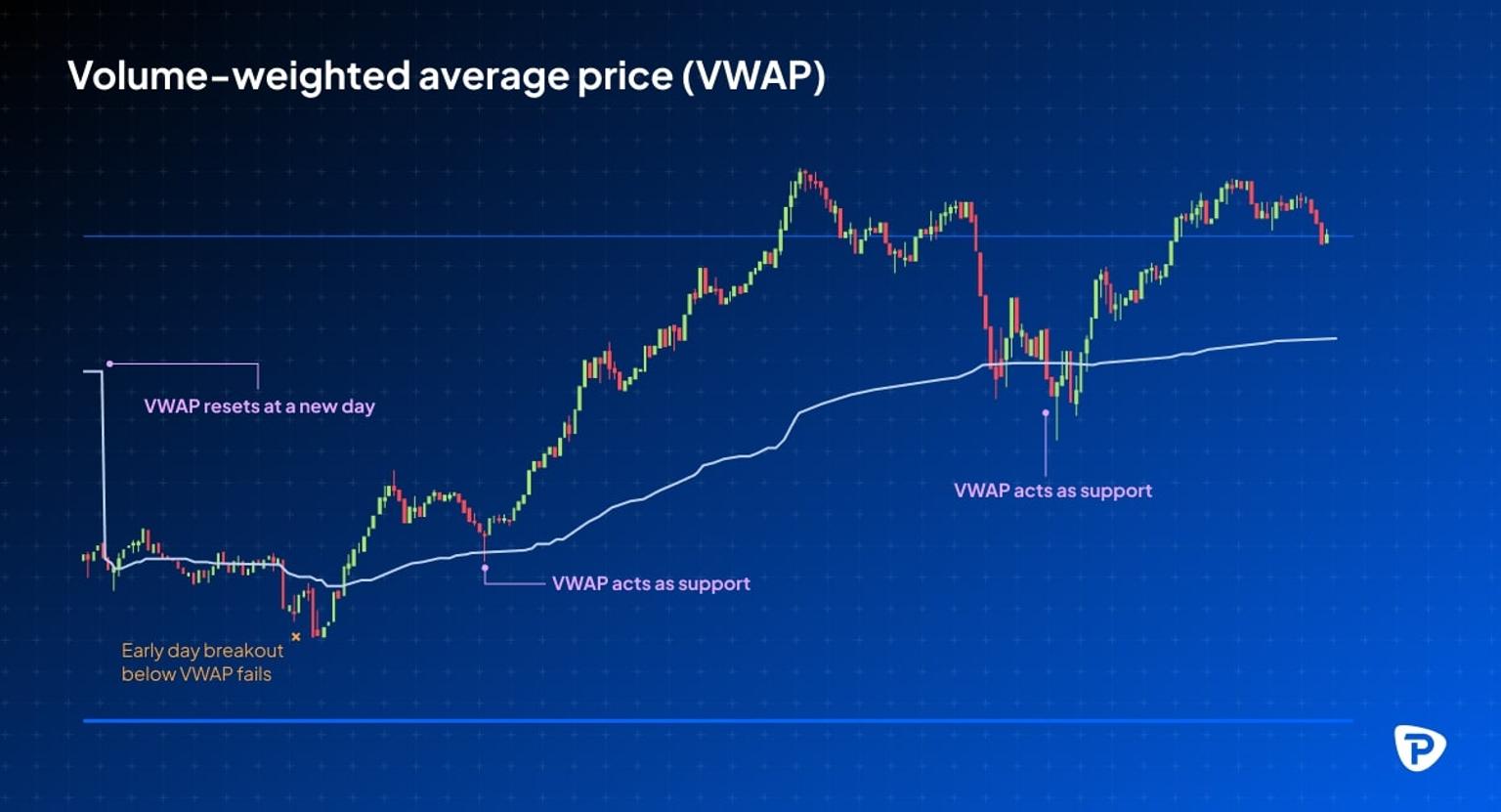
- Volume-weighted average price (VWAP): This calculates the average price of an asset weighted by its volume, providing a measure of the asset's ‘fair’ value during a specific trading period. It is primarily used to assess whether you can buy or sell at a favourable price.
Managing risk when trading with market charts
Using charts successfully in your trading requires a disciplined approach to analysis and decision-making. Interpreting the charts in isolation isn’t enough; rather it requires integration with robust risk management, emotional control, and a clear trading strategy that involves learning from previous experiences and adapting to the dynamic nature of market conditions.
Take particular care to:
Avoid confirmation bias
Use a variety of technical indicators instead of depending on just one. This contributes to a more balanced and thorough understanding of market conditions, limiting the possibility of biased views.
Set stop-loss & take-profit orders
Use stop-loss orders to limit potential losses and prevent damaging financial setbacks. Use take-profit orders to secure profits when price targets are met.
Key takeaways
- Market charts visually represent price action, making it easier to analyse market movements and trends.
- Different chart types—line, bar, and candlestick—each have unique advantages depending on the depth of information needed.
- Trends, support & resistance, and key price levels are the foundation of technical analysis.
- Using technical indicators like moving averages, RSI, and Bollinger bands can help confirm price action and reduce guesswork.
- Chart patterns, such as head and shoulders, flags, triangles, and double tops/bottoms, provide signals for potential trend reversals or continuations.
- Multi-timeframe analysis offers a more comprehensive market perspective, allowing traders to align their strategies with different time horizons.
- Risk management is just as important as identifying trade opportunities—setting stop-loss orders and avoiding confirmation bias can help you protect your capital.