What are candlestick pattern charts and how can you read them?
Candlestick charts are a fundamental tool in technical analysis, providing traders with visual insights into price movements over specific periods. By understanding candlestick patterns, traders can identify potential trends and reversals, making them invaluable for analysing most tradable asset classes and financial instruments.
Written by: Aubrey Hayward | Expert Financial Writer
Originating in Japan over 200 years ago, these charts have helped traders better understand market trends and make informed trading decisions and are now an essential part of modern trading strategies amongst market professionals. In this article, we will explore what candlestick charts are, how to read them, and why they are essential for traders. Additionally, we’ll explore common candlestick patterns, their significance, and how they can be integrated with other technical analysis tools.
What are Candlestick Patterns?
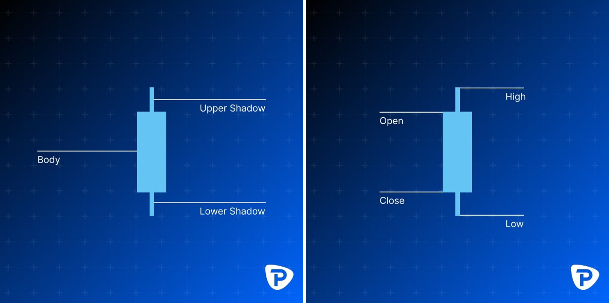
Candlestick patterns are graphical representations created by the movement of prices for a given asset over a specified period on a candlestick chart. Each candlestick represents four key pieces of information: the Opening price, High price, Low price and Closing price during that time (e.g., one day, one hour), also known as OHLC. Candlesticks consist of a body and wicks (or shadows) that extend above and below the body. This method provides a more comprehensive view of price action than traditional line charts.
Basic Structure of a Candlestick
How do I read a Candlestick chart?
Reading a candlestick chart involves understanding the individual candlesticks and their patterns. Each candlestick provides information about the market sentiment during a particular time frame.
Knowing how to read candlestick charts can help you to identify or predict market movements. You read a candlestick by looking at its colour, body and wick:
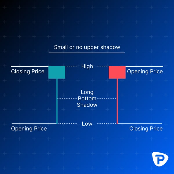
The Body: The candlestick's body equates to the range between the opening and closing prices.
The Wick (Shadow): The lines extending above and below the body are known as wicks or shadows. The upper wick ‘extreme’ represents the highest price during the period, while the lower wick ‘extreme’ represents the lowest price. A candlestick with a long upper wick and a short lower wick indicates that buyers were highly active during the trading period, pushing prices up significantly. However, sellers were dominant and drove the prices down from their peak, resulting in the market closing below the high point, which is reflected in the long upper shadow.
On the other hand, a candlestick featuring a long lower wick and a short upper wick shows us that sellers initially pushed prices down, but buyers entered the market at lower prices, leading to a recovery. This buying activity caused the market to close higher, as evidenced by the long lower shadow.
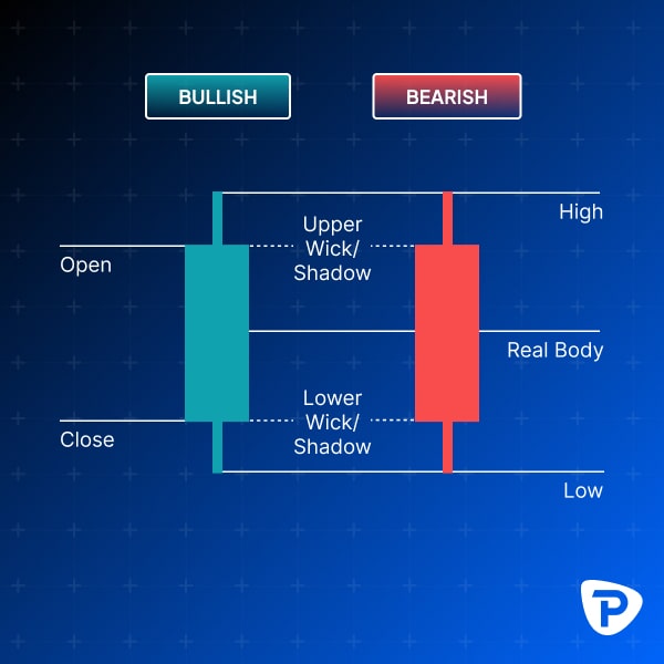
The Color: The colour of the candlestick body helps traders quickly identify whether the price moved up or down during the period. If the closing price is higher than the opening price, the body is typically coloured green (or white), indicating a bullish period. Conversely, if the closing price is lower than the opening price, the body is coloured red (or black), indicating a bearish period.
What is the Difference between a Bullish and a Bearish Candlestick?
A bullish candlestick suggests that buyers were in control during the period (typically green or white), pushing prices higher and closing higher than the opening price of that timeframe. Conversely, a bearish candlestick indicates that sellers dominated (typically red or black), driving prices lower to close below the opening price.
Why are Candlestick Patterns important in Trading?
Candlestick patterns can help traders identify potential market reversals or continuations. By analysing these patterns, traders can make more informed decisions about when to enter or exit trades. There are many candlestick patterns which act as valuable indicators for traders looking to make price movement predictions.
What are some common Candlestick Patterns I should know, and how do I identify a possible trend or reversal?
Several candlestick patterns can signal possible future market movements. Here are a few common ones:
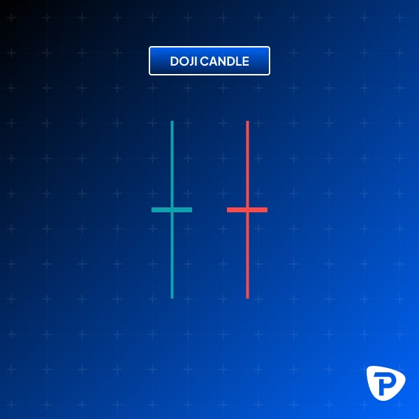
1 - Doji: A Doji candlestick, which typically looks like a cross, inverted cross, or plus sign, shows that the opening and closing prices for a trading period are almost the same. This pattern often indicates market indecision and suggests that the current trend might continue. The shadows or wicks of a Doji candlestick provide valuable insights into market sentiment
(to be covered in article 2).
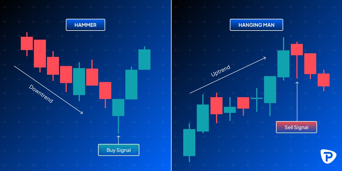
2 - Hammer and Hanging Man: Both Hammer and Hanging Man candlesticks have a short body with a lower shadow or wick that is at least twice the length of the body. A Hammer generally appears at the end of a downturn, indicating a bullish reversal pattern and suggests the market is trying to find a bottom. The long lower shadow indicates that sellers pushed the price down during the session, but buyers could absorb this pressure and push the price back up near or above the Opening price, signalling potential bullish momentum. Traders often look for a higher opening price in the next trading session to confirm the Hammer as a bullish reversal signal.
Conversely, a Hanging Man is a bearish reversal pattern that appears at the end of an uptrend. It looks identical to the Hammer but forms at the top of an uptrend. The Hanging Man pattern is significant only when it occurs after an uptrend. It indicates that the uptrend may be losing momentum. The long lower shadow shows that selling pressure increased during the session, but the bulls managed to bring the price back up near the opening level. However, this action suggests that selling pressure might dominate soon. Traders seek confirmation through a lower opening price in the subsequent trading session to validate the Hanging Man as a bearish reversal signal.
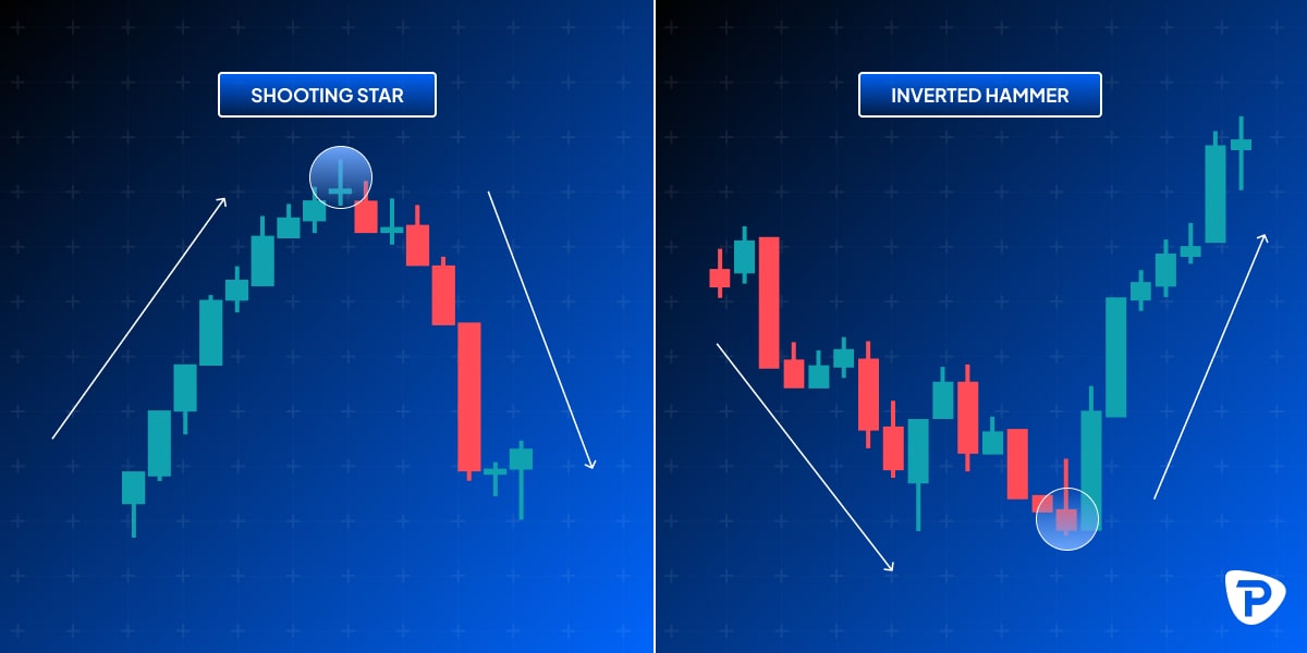
3 - Shooting Star & Inverted Hammer: This pattern is the opposite of the Hammer pattern and is a single candle with no or a very little lower shadow. The primary feature of this pattern is the long upper shadow, noting that the longer the upper shadow, the stronger the pattern. Like the Hammer, the upper shadow should be at least twice the length of the body. The Shooting Star pattern indicates that an uptrend might be nearing its end. During the session, buyers managed to push the price higher, but sellers had taken over by the end, driving the price back down near the opening level. This price action indicates that buying pressure is waning and selling pressure is increasing, which could signal the start of a downward move. The Inverted Hammer is a bullish reversal pattern that typically appears at the bottom of a downtrend. It is characterised by a small real body at the lower end of the trading range and a long upper shadow. The pattern resembles an upside-down version of a regular Hammer candlestick.
So, the Shooting Star is a bearish reversal pattern, and the Inverted Hammer is a bullish reversal pattern.
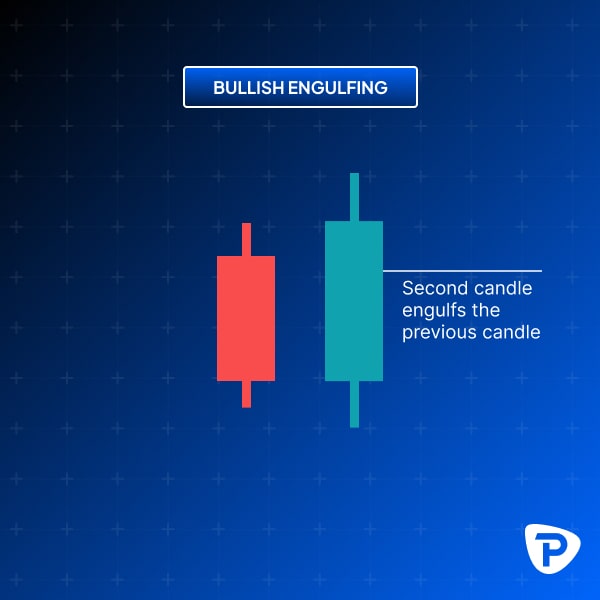
4 - Engulfing Pattern (Bullish & Bearish): Bullish and bearish engulfing patterns consist of two candles.
A Bullish Engulfing pattern forms when a smaller bearish candle is followed by a larger bullish candle, signalling a potential upward reversal. This pattern indicates that buyers are gaining control after a period of selling pressure.
How to identify the Bullish Engulfing Pattern:
- The First Candle must be bearish (typically red or black).
- The Second Candle must be bullish (typically green or white).
- The body of the second candle must completely cover the body of the first candle.
This two-candle bullish pattern is considered to be a reversal pattern, primarily used to identify potential market bottoms. Traders look for this pattern after a downtrend, as it suggests that the bulls are beginning to take control, and an upward movement may follow.
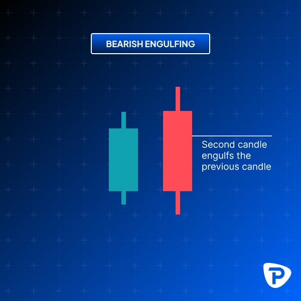
The Bearish Engulfing pattern forms when a smaller bullish candle is followed by a larger bearish candle, signalling a potential downward reversal. This pattern indicates that sellers are gaining control after a period of buying pressure.
How to identify the Bearish Engulfing pattern:
- The First Candle must be bullish (typically green or white).
- The second candle must be bearish (typically red or black).
- The body of the second candle must completely cover the body of the first candle.
This two-candle bearish pattern is considered to be a reversal pattern, primarily used to identify potential market tops. Traders look for this pattern after an uptrend, as it suggests that the bears are beginning to take control, and a downward movement may follow.
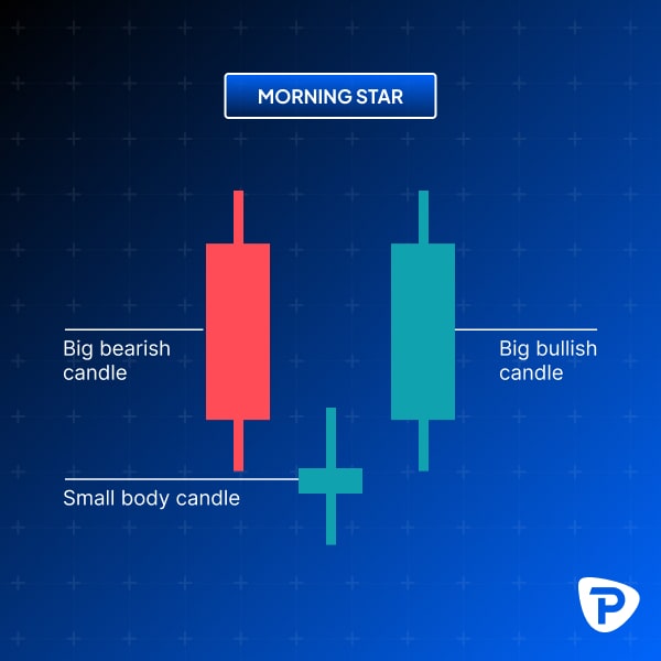
5 - Morning & Evening Star: The Morning Star candlestick pattern is formed by three candles.
Here’s how to identify the Morning Star candlestick pattern:
- The first candle must be bearish (typically red or black).
- The third candle must be bullish (typically green or white).
- The second candle must be small compared to the others on either side of it.
- The colour of the second candle is mainly irrelevant.
- Preferably, the second candle's body shouldn’t overlap with the bodies of the other two candles.
This three-candle bullish candlestick pattern is a reversal signal used to identify potential market bottoms. It is most effective when observed after a downtrend, indicating that buyers are beginning to take control. When a Morning Star candlestick pattern forms at the appropriate point, it can signal the end of a downtrend and the start of a new uptrend or the end of a pullback within an existing uptrend.
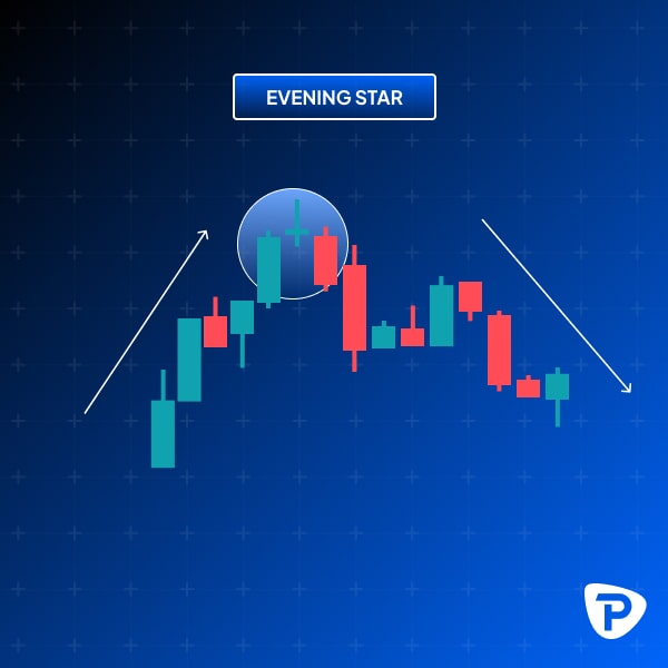
The Evening Star is the bearish reversal counterpart to the Morning Star. This pattern appears at the top of an uptrend and signals a potential reversal downward. All four conditions that define a Morning Star structure also apply in this context. The first candle should be long and bullish toward the end of an uptrend, indicating strong upward momentum. The second candle appears at the top and reflects market indecision, whether green or red. The third and final candle signals the beginning of a reversal, showing buyers are losing control over the price action and a potential downturn is on the horizon.
How Do I Identify a Trend Using Candlestick Patterns?
Trends are identified by analysing a series of candlesticks. Uptrends are characterised by a series of higher highs and higher lows, while downtrends show lower highs and lower lows.
How Do Candlestick Patterns Relate to Other Technical Analysis Tools?
Candlestick patterns are often used with other technical analysis tools, such as moving averages, trend lines, and volume analysis, to confirm signals and improve trading accuracy.
Can Candlestick Patterns Be Used for All Types of Trading?
Yes, candlestick patterns are versatile and can be used across various types of trading, including stocks, forex, commodities, and bonds. Cryptocurrencies, though, have some caveats to be aware of being unregulated and traded 24/7, thereby making ‘official’ Daily opens and closes hard to identify; hourlies or shorter (e.g. 1,5,30 minute), therefore, are a better proxy. Overall, Candlestick’s general universal applicability makes them an essential tool for traders.
What Are the Limitations of Candlestick Patterns?
While candlestick patterns are powerful, they are not infallible. They can sometimes produce false signals, especially in volatile markets. One should only trade in markets with good liquidity and be aware of pending data or announcements that could cause erratic price action. It's essential to use them in conjunction with other analysis tools and not rely solely on them for trading decisions.
Can I Use Candlestick Patterns for Day Trading?
Absolutely. Candlestick patterns benefit day trading, where traders make multiple trades within a single day. They help identify short-term trends and potential entry and exit points and can be followed in as short a timeframe as one-minute intervals. If you are day trading, always be aware of the Open and Close times when trading Exchange-Traded products.
What is the Best Time Frame to Use Candlestick Patterns?
The best time frame depends on your trading style. Day traders may prefer shorter time frames (e.g., 1-minute, 5-minute charts), while swing traders and long-term investors might use more extended time frames (e.g., daily, weekly charts).
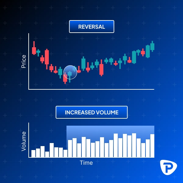
How Do I Combine Candlestick Patterns with Volume Analysis?
Volume analysis can enhance the reliability of candlestick patterns. For instance, a bullish engulfing pattern with high volume is likelier to indicate an actual reversal than one with low volume.
Conclusion
Understanding candlestick charts and patterns is a crucial skill for any trader. These charts provide a visual representation of market movements and help in making informed trading decisions. You can start using candlestick patterns in your trading and practise interpreting their signals, such as using a Pepperstone demo account. This will enable you to use the charts and place trades in real time without risking any actual capital. Alternatively, if you feel confident enough to use them in your trading, you can open a live account with Pepperstone.
The material provided here has not been prepared in accordance with legal requirements designed to promote the independence of investment research and as such is considered to be a marketing communication. Whilst it is not subject to any prohibition on dealing ahead of the dissemination of investment research we will not seek to take any advantage before providing it to our clients.
Pepperstone doesn’t represent that the material provided here is accurate, current or complete, and therefore shouldn’t be relied upon as such. The information, whether from a third party or not, isn’t to be considered as a recommendation; or an offer to buy or sell; or the solicitation of an offer to buy or sell any security, financial product or instrument; or to participate in any particular trading strategy. It does not take into account readers’ financial situation or investment objectives. We advise any readers of this content to seek their own.